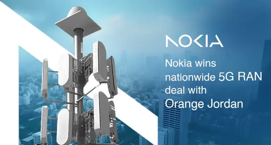
If any company deserves recognition with the "Ride against the Tide" award, it would undoubtedly be Nokia. Despite the decline in popularity of its mobile handsets, Nokia adeptly shifted its focus to the mobile network segment. As a result, we continue to benefit from Nokia's services indirectly through our service providers.
Even though the company eventually redirected its efforts toward supplying networking equipment and services to businesses, the majority of people, particularly in India, still associate Nokia with mobile phones. As a business owner, you grasp the significance of remaining contemporary and pertinent. However, what occurs when your brand no longer connects with your audience or fails to embody your company's principles? This is where rebranding becomes essential.
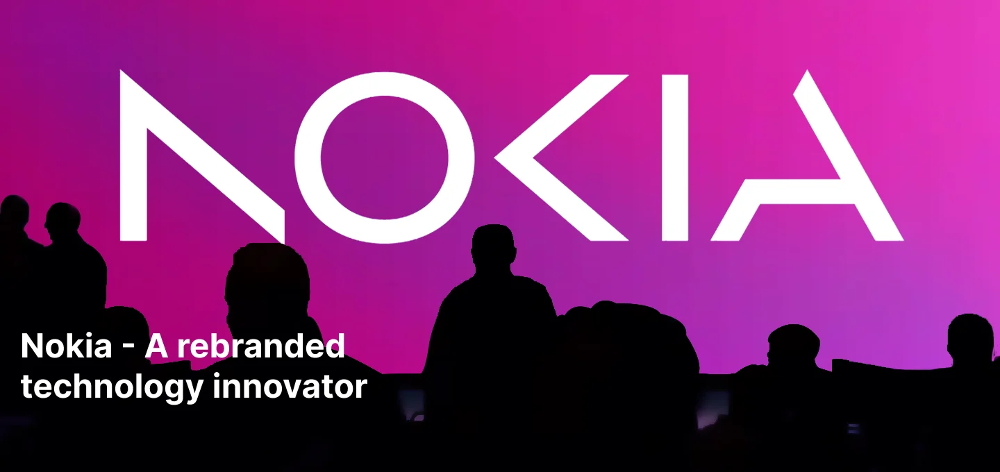
The New Nokia
If you've overlooked it, Nokia no longer produces phones, but here's a refresher: At the 2023 Mobile World Congress, the original phone giant introduced its first rebranding effort in 60 years. With this updated Nokia logo, the intention is evident - Nokia aimed to redefine its business identity, distancing itself from its formerly iconic mobile phone endeavors.
“In most people’s minds, we are still a successful mobile phone brand, but this is not what Nokia is about,”
Nokia CEO Pekka Lundmark
The refreshed logo was created in collaboration with consulting firm Lippincott, forming part of Nokia's broader rebranding strategy to position itself as "a B2B technology innovation leader unlocking the power of digital across every industry."
Immediate feedback - does the new logo lack legibility?
Certain experts have noted a notable challenge with legibility in the new logo, underscoring the significance of clear and distinct lettering. A logo should be readily identifiable and effectively communicate the brand's name. Reduced legibility can result in confusion, misinterpretation, and a detrimental effect on brand image.
Although many appreciated the vibrant colors and gradients employed, there were reservations regarding the legibility of the letters. The fusion of the 'N' and 'K' introduced ambiguity and rendered it challenging to distinguish the intended letters, potentially resulting in issues with brand recognition.
Benefits that Nokia saw in this Bold Move
Nokia has transitioned away from being a B2C company and thus does not require the same level of visibility and clarity it once did when it primarily sold mobile handsets. Instead, it seeks recognition as a B2B technology innovation leader, focusing on enabling customer and partner ecosystems to develop the digital services and applications of the future. This underscores what can be achieved when global collaboration is fostered.
“Our new logo is a bold evolution of the 1960s classic. It’s dynamic, precise and brings new meaning, cleverly representing our purpose with abstracted letters that, when acting together, read as Nokia.”
The fresh digital-first identity stands out with a vibrant color scheme and captivating visuals, distinguishing itself from the industry's uniformity. The N, O, and K letterforms in the logo have been transformed into bold graphics, guaranteeing that every communication from the brand is distinctly Nokia. This rebranding effort represents a significant milestone for the company as it aims to redefine its market presence. While opinions on the impact of the rebranding may differ, Nokia's commitment to adapting to changing market dynamics and staying pertinent in the technology sector is unmistakable.

Nokia after one year of Re-branding
This transformation was integral to the brand revitalization strategy implemented by the company. It went beyond superficial changes to the brand identity. Nokia sought to align itself with the dynamic tech landscape and rejuvenate its brand appeal following setbacks in the mobile handset segment against competitors like Android and iPhone.
Nokia's revitalization strategy centered on modernizing the company's logo and messaging to mirror its renewed focus on 5G/6G networking technology. The redesigned logo and messaging are crafted to communicate this strategic pivot, positioning Nokia as a frontrunner in the new generation mobile network sector. This holistic approach ensures that Nokia stays pertinent to new customers and partners searching for innovative solutions to technological hurdles. In essence, Nokia's strategy exemplifies a deliberate brand revitalization endeavor, going beyond just superficial logo changes.